Showing posts with label Exercise 4. Show all posts

Wednesday, February 6, 2008

Exercise 4 -Julian Apong


My cycling map of Toronto showed the major cycling routes for the downtown core. It had an easy to read and find legend. The only real problem was the amount of irrelevant information on the Bike Path authority and their mission statement, which could have been removed in order to make the map larger and easier to read.


The bike paths themselves were easy to locate, highlighted in a bold blue line that made their routes obvious. The inclusion of side streets increase the amount of noise on the map but are ultimately necessary in order to make the map as useful as possible. Very little of the map is actually bicycle paths, however. They could replace the large section where there are no bike paths available with close-ups of the biking areas.

Exercise 4

My map is the TTC Ride Guide which comes folded in a handy, pocket sized brochure. When fully opened, this map of the GTA shows all bus and streetcar routes, as well as the subway lines. Colour coding and the thickness of lines are the strategies used to make this map easy to read and follow.

Routes that are more frequently travelled are represented with bold and thick lines. For example, all subway routes have bold coloured lines, the main VIVA bus routes are moderately thick, and all bus and streetcar routes are represented with thin, red lines.

According to this map, the Yonge-University-Spadina subway line is yellow, Bloor-Danforth line is green, Scarborough RT is blue and Sheppard is purple. The strategy is that when the colored lines intersect, they are points of transfer on the TTC.

On the reverse, there is a large downtown map, a smaller full subway transit line map, a mini-map of the blue night network, as well as a mini GO transit system map.

I use this map very often and it is helpful to all the people of Toronto and visitors.

Map Exercise - Diandra

Communications and Tourist Map of Wuxi
When first unfolding the map, I, the viewer had no idea where Wuxi was. After doing some research on the internet, I found out it was a city in the Jiangsu Province of China. Personally, I feel as if this map is visually and aesthetically pleasing, due to its intricate colour coding and delicate minimalist detailing of street names and areas. It also acts as a topographical map as it depicts the altitude and elevation of the mountainous ranges in Wuxi (bottom left). It has a legend in the bottom right hand corner of the map that helps decipher where different municipal government institutions, district government institutions, post offices, hotels, restaurants, hospitals, schools, gas stations, and parking lots are. This is a very simple and easy-to-use map that has lots of information on different gardens, hotels and temples on the back along with more detailed maps of the city itself and its downtown core.

If I ever were in or near Wuxi, I would defiantly use this map.

Tuesday, February 5, 2008

Exercise 4-Katie


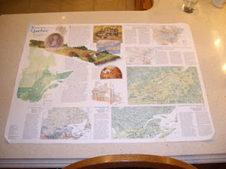
This map of Quebec, produced by National Geographic, is divided into two sides. Side A provides a brief history of the 
founding of Quebec. The development of Quebec is categorized into 5 sections, starting at 1750 (European Empires on Native American Land) to 1950- Present (Modern Quebec). The Maps evident on Side A display numerous amounts of stats regarding language between Quebec and the rest of Canada. Different colors represent different language, for example Blue=French, Red=English, Purple=Bilingual.


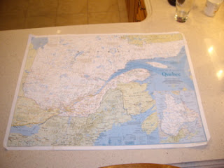
Side B shows Quebec and its surrounding 
 areas including other provinces, states, bays and lakes geographically. Monochromatic hues enhance the pop-out effect within the elevations found throughout the map. Furthermore, bold fonts are used to highten the provinces (states and capitals) successfully using minimal noise. Like Side A, the map displays a lot of information and uses layering to help one follow easily.


I do believe that National Geographic successfully conveyed a HIGH signal-to-noise ratio. Unfortunately, the legend was difficult to locate as well as understand. The scale, abbreviations and geographical equivalents were closely located to the legend, making it seem extremely cluttered and hard to understand.


Sunday, February 3, 2008

Exercise Four - Andrea

My map shows a mountain biking path that stretches from Platoro, Colorado to Pie Town, New Mexico. It’s called The Great Divide.
On the first side, Map A displays half of the route – from Platoro, to Cuba, New Mexico. Map B, on the back, Cuba to Pie Town is shown. I think it was a great idea to split the map into two sections, for simplification purposes. The history of the trail, tips for travel, and general information are found in white boxes near the top left of each side. (law of proximity, alignment) The service directory is located at the bottom right. The box displaying road signs and service symbols should be in plain view, as a main focus on the map, which it isn’t. The Profile showing general elevation levels is clear and concise. It also seems to be the main thing my eye focuses on because of its dark colours and gigantic title. (Is this really the most important thing on the map?) Since they are layered on top of the map, these boxes hide much of the geographical information.
The different coloured lines that sprawl across the map confuse me. On side B, there are dotted pink lines, and a purple line that aren’t found in the legend. What do they mean? Another thing I find puzzling is the collection of brown boxes scattered all over the map. They’re highlighted to show unity, and seem to contain step-by-step instructions according to how many miles you’ve covered, but there is no way of knowing exactly what spot on the map is being talked about. There are many star symbols all over the trail that represent important points, but there are no clear corresponding numbers to match the brown-box directions to the map. Perhaps along the path there are clear road signs, but not knowing until you are actually on the trail seems a little bizarre.
the mysterious brown box - covers important parts of map, and information it contains doesn't make sense!

All in all, I think that having the map as a directional tool should be the first priority. If you want to know how you should prepare, get a guidebook. Too many boxes and too much writing makes this map crowded. There’s not enough clarity as far as paths and signs go. Realigning elements, using more colour in better ways, with more variation and contrast, and clarifying legends would have made for a more comprehensible map.

Excercise 4 - Kay Lee

Florida with Puerto Rico and the U.S. Virgin Islands
The front page, continued to the back page of the map when unfolded, has an illustration of
various species of birds that represent Florida's rich birdlife.
Animal is a familiar subject that draws attention from the viewers/readers in a favorable sense.
Also, it's notable that the map was printed by National Geographic.
The back page of the map, divided into six columns, follows the Gutenberg diagram,
with its title in a stronger font at the primary optical area, and an image at the terminal area,
but it seems its strong/weak follow areas are not clearly proved. (100)


This map achieves aesthetic color combinations by using analogous colors,
such as green and blue, complementary colors, such as red and green,
and triadic and quadratic colors, such as orange and green.(38)
The symbolism of the colors used here is quite obvious and universal;
blue for sea and green for forest.
By employing example icons, it specifies the regions, infrastructure, territories, etc.
For example, National Wildlife Refuges uses a pictorial image of a bird on the wing,
and a simplified image of an airplane represents the airports.(110)
The consistency of the icons enables viewers/readers to efficiently
recognize and communicate with the map.(46)
Also, opaque layering is used in order to deliver information about important
locations or special events going on each place, probably on purpose of tourism.(122)
Highlighting of the fonts is used to differentiate the administrative districts,
usually the larger , bold, uppercase fonts means the larger district.(108)
"Florida" is the largest visible text as well as the names of the oceans.

I like this map since it's visually pleasing, but I always prefer using mapquest.com for any purpose.
Paper maps are, no matter how well the map is designed, it's always overloaded by too much information
on a limited size of the map. The folded edges start to rip or the areas on the edges become rubbed out.
This kind of map is good when I'm planning for a travel abroad or as a decoration of the walls in my room.


Excercise 4: David McInerney

Kimberley Ranges - Western Australia


This Road Map employs the use of "icons" to distinguish major and minor roads, cumulative distance, gas stations, trailer parks and points of interest - these icons are explained in a table at the centre bottom on the map. The map also has a "Map Index", much like a street directory that corresponds to the numeric and alphabetic grid that links to the margins. Highlighting is used to warn drivers of road conditions and even swimming conditions i.e "Crocodiles may be found in saltwater and freshwater!!" The Indian Ocean and Timor Sea are highlighted using a serif font, while most inland areas use a san serif font. Layering is used to highlight urban centres in greater detail by creating separate localised maps on the left hand side of the map (over the water). Blue and tones of green distinguish water from varying fertile and barren land mass, I feel that the green does not adequately represent drought stricken areas. The reserve side of the map provides in depth text, on topics such as; conditions of pavements, the best seasons to travel and two other localised maps of cities.

My visceral reaction to this map was that it made me homesick! I have never been to Western Australia (its a long way from Sydney), but the outline of the coast from Port Hedland to Darwin is recognisable on most maps of Australia. This map works for me, I feel that the alignment of the roads on the grid is successful. The map adequately represents the highway system. It has a high Signal-to-Noise ratio.

Aussie Aussie Aussie Oi Oi Oi

Exercise 4- Lena Hong

This map was containing the information of the whole world, and the title of this pap was "The world physical" map , which as seen in the picture, shows all the continents and cities. This map was easy to read because all the continets/countries were divided into separate colours, which highlights all the details. On the other side of the map there is another map that only shows the elevation of the countires/water bodies. This page was not easy to read because the colours used were yellow-ish colours, and green, which I didn't know what it meant. The readability of this map was average; the front page was easier than the elevation page. but it would have been better if main cities were labled only, because with small letter and arrows, it was kind of confusing me, and it was hard to read the country name itself. Overall, I think the map was a success of conveying information, especially the lables and different colour outlines of the countries, but I think the size of the map is too big for tourists or bikers to carry, because it was hard for me to take a picture of the whole map.


Exercise 4 - Joanne


One of the strategies used to convey information is highlighting. The map uses a different colour to highlight the water bodies from the landmasses. Another highlighting technique used in this map is with the use of bold and italics texts. In addition different fonts are used as well. Another strategy used is alignment. This map uses many complex forms of alignment, for example the names of the waters or water features are aligned in the same directions as the feature or along the ridge of the feature. Overall this map works for me because it is very similar to other maps about the analysis about land surfaces or landforms (like geomorphometry maps).


Exercise 4 - Gio Petrucci


Toronto Cycling Map 2006

Visually, the cycling map consists of Downtown Toronto as a whole. The paths are concise within the areas to which the cyclists would naturally correspond with when mapping out where they would be able to ride their bike’s within the city. All extra information helping decode the map (colour, patterns) are located framed, over where the water would be as to not interfere with any of the Toronto land areas which are pertinent to the map. The map has no problems helping the cyclist know where they are able to take their beloved rides. As long as a basic understanding of the city’s layout is there, getting lost is almost impossible. The main streets are mapped out efficiently so a general knowledge, like I said, is all that is needed to navigate one’s self.

Personally, if I still owned and used a bike, this map would be useful in the sense that I do know the downtown area and would have no problems taking this and venturing out around town by myself. The map is clear, coloured quite well for quick and easy legibility. Colouring corresponds to how the city works. Green for grass and vegetation, grey for roads and taupe for the rest of the city.

Saturday, February 2, 2008

Excercise 4 - Kaylyn Frecker

Kowloon Street Plan Map


cover shot


open map


I think I would be able to decode this map a bit better if it was in English but I'll give it a shot anyways. I struggled to really find anything wrong with this map. Even though it is in a different language I figured out the coding into a very short time. I was able to learn that instead of placing any street names on the map they place numbers in place and expect you to flip the map to find the street. Which in result is a much clearer visual map.


Friday, February 1, 2008

Exercise Four: Miriam


The map uses the element of highlighting, by making important locations (Information/Visitor Centres) stand out against the map by the use of a green background against the text. It makes it easy to find for the viewer, the information area is an important location that people want to find fast when they need help. Caps are used to show the main larger areas of land, in this case it is the national park areas. The confusing thing is, is that the colour the map uses to highlight these elements are very similar to each other. The map uses the element of closure as well. The trails are shown as a dashed line, but the mind automatically observes it as a connected line and leads the eye throughout the map. The third element that the map introduces is layering. There are several layers of land and glaciers, or text that form the three-dimensional layering effect. Here they are shown as transparent layers. This map provides general information about the area. If I was going to a National Park, I would want to receive a map with much more detail however, including path systems, elevations, distances. This map just gives an overview of the general key points. It would be hard for anyone to use this map to get anywhere. This map seems to be more of an informational pamphlet, just illustrating the locations and the activities that go on throughout the park. It is good to see that the icons showing bathrooms, telephones, campground are clearly shown because viewers need this fact. This can be based on iconic representation, these images can be easily figured out by anyone because of their simplicity, This map uses similar icons. They are highlighted with a black background with a white illustration making them easier to spot. It’s annoying to see maps with icons with no background, they are too small to identify and that pretty much sucks. The map also gets some bonus points for being done in a normal range of colours, the water is blue, land is green, nothing is done in crazy colours like purple for land instead. The map has many positive views to it but much more negatives however, I just don’t find it detailed enough.

Exercise 4- by Shona


A Fishing and Recreation Map of Manitoulin Island- Deconstructed

This map uses one of the “Five Hat Racks” systems of organizing information, that of Location. This is, “organization by geographical or spatial reference” and used, “when orientation and wayfinding are important or when information is meaningfully related to the geography of a place (e.g. a historic site).” Routes and their names, and icons representing points of interest such as marinas and campgrounds, are overlaid on a depiction of the space they cover.
Another way this map conveys information is Iconic Representation. Icons have been created for points of interest and are explained on the legend at the lower left side of the map. These icons allow one to easily spot destinations. Some of the icons are “Example” icons: “icons that use images of things that are commonly associated with an action, object or concept”, such as an image of a sailboat to represent a marina. Others are “arbitrary” icons that have to be learned: for example, the letter G indicates where to fish for Largemouth Bass.
Though this map works okay for conveying its information, I think its use of colour works against it, both aesthetically speaking, and for conveying information. The water, which is the “ground”, is in a much more saturated colour than the “figure”, the land mass of the island, and therefore “pops” out and draws the eye to it. The colour of land mass is also very bland. I think the purposes of this map would be better served if the island was done in richer greens and the body of water in a pale blue. And it might be more aesthetically pleasing, and thus more interesting to look at as well.

Thursday, January 31, 2008

Exercise 4: Read A Map

Discover Tibet
Exercise 4: Read A Map

There is highlighting used to make the legends stand out by having box’s around them in a darker colour. There is also highlighting used on main trails on the map. Layering is also used when roads overlap and the positioning of the legends as they cover parts of the map. When this map was first given to me, my reaction was that it would be impossible for me to do anything with the map. The map does not work for me. The big reason why is because its written in a language that I can not read, and there are barely any symbols that would even give me a hint of what’s on the map. Also another reason I don’t like it is because some of the stuff in the legend is located on the map in basically the same colour as the background which makes it very hard to see.

Wednesday, January 23, 2008

Exercise Four: Read a Map

You have been assigned a map. In one concise paragraph, deconstruct its strategies for conveying information for the class, using the vocabulary introduced in Exercise Three, as well as any new vocabulary you've learned from reading Universal Principles of Design (hint: this is bonus mark territory). Maps contain many visual elements: focus on one or two strategies only.

Conclude with a statement describing your visceral reaction to the map: does this map work for you? Why, or why not? Is this reaction solely a product of the success or failure of the map to convey information, or are there other factors at play?

Provide at least three images of your map: one of the folded map, one of the entire map, and one detail that shows the strategies in question.

Exercise Four is due on Sunday, February 3 at 11:59PM. Please do not lose or damage my maps!