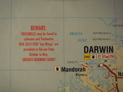
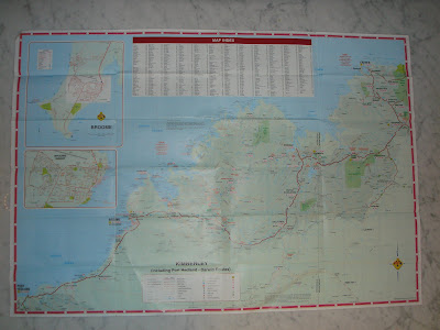
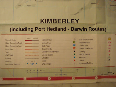
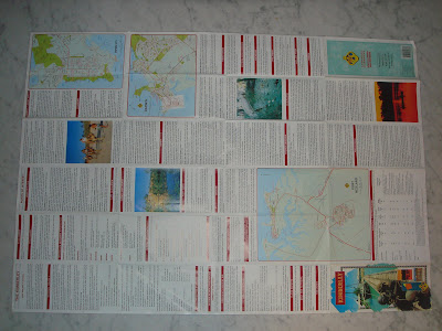
This Road Map employs the use of "icons" to distinguish major and minor roads, cumulative distance, gas stations, trailer parks and points of interest - these icons are explained in a table at the centre bottom on the map. The map also has a "Map Index", much like a street directory that corresponds to the numeric and alphabetic grid that links to the margins. Highlighting is used to warn drivers of road conditions and even swimming conditions i.e "Crocodiles may be found in saltwater and freshwater!!" The Indian Ocean and Timor Sea are highlighted using a serif font, while most inland areas use a san serif font. Layering is used to highlight urban centres in greater detail by creating separate localised maps on the left hand side of the map (over the water). Blue and tones of green distinguish water from varying fertile and barren land mass, I feel that the green does not adequately represent drought stricken areas. The reserve side of the map provides in depth text, on topics such as; conditions of pavements, the best seasons to travel and two other localised maps of cities.
My visceral reaction to this map was that it made me homesick! I have never been to Western Australia (its a long way from Sydney), but the outline of the coast from Port Hedland to Darwin is recognisable on most maps of Australia. This map works for me, I feel that the alignment of the roads on the grid is successful. The map adequately represents the highway system. It has a high Signal-to-Noise ratio.
Aussie Aussie Aussie Oi Oi Oi
No comments:
Post a Comment