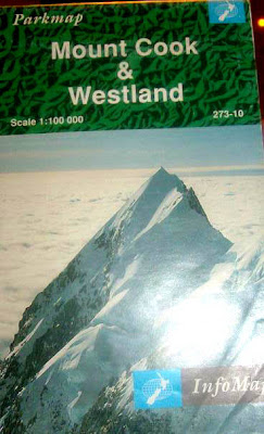
This map is of Mount Cook and Westland. I have no idea where this place is, and so first things first, I tried finding exactly where Mount Cook and Westland is located. I had to open up the map to find a small illustration of an island with a star indicating what part of the island is being observed, however what island was this I still didn’t know. It looked like New Zealand, still, I wanted to make sure that I wasn’t looking at an island from the Caribbean or South East Asian region. Visually there was no indication of what this illustration was of, I had to read a paragraph from the back to find out that indeed this was New Zealand. The map is girded in columns; numerical horizontally and alphabetical vertically. The use of color is used to specify greenery such as parks and foliage form snowy areas such as glaciers. The use of shadows are even rendered to demonstrate elevation in mountain peaks
The legend seems invisible as it blends into the frame that crops the map. It also includes too many red icons, suppose to using a wide pallet of color. The scales are in both metric style and American which I find very convenient for tourists. There is a small paragraph of general info about the park, even shows a set of rules for campers, such as; protect plants and animals and remove all rubbish produced. There are two zoom-in maps of Fox and Franz Josef Glacier. They are separated from the main map and placed on the top left corner. They include their own scales, but only metric this time. The main maps show where the zoom-ins are located with a dotted outline . I feel that this could be better defined.
Another zoom-in map of Mount cook is placed on the bottom right of the main map. This time
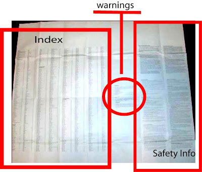
 it overlaps and hides some features of the larger map. On the back, it shows the index. Places are divided in categories of towns and localities, huts, roads and tracks, glaciers, rivers, lakes and waterfalls, and other natural features. There is also a warning telling readers that the weather in New Zealand can rapidly change. It is shown in two other languages. Considering this is a warning, I don’t understand why it doesn’t stand out more. There is also info on safety, what to do if you are lost, and what to do in an accident. These are things that are very essential to know, but they are shown in the map as if they are have no importance at all. All in all I find this map sufficient enough to be used properly. The only issue I have is of the distinguishing aspect of the map. It is very hard to make out one feature of the map from the other, especially the back, since there is nothing used to help bring these features forward.
No comments:
Post a Comment