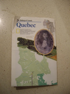
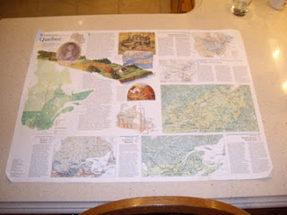
This map of Quebec, produced by National Geographic, is divided into two sides. Side A provides a brief history of the
founding of Quebec. The development of Quebec is categorized into 5 sections, starting at 1750 (European Empires on Native American Land) to 1950- Present (Modern Quebec). The Maps evident on Side A display numerous amounts of stats regarding language between Quebec and the rest of Canada. Different colors represent different language, for example Blue=French, Red=English, Purple=Bilingual.
 areas including other provinces, states, bays and lakes geographically. Monochromatic hues enhance the pop-out effect within the elevations found throughout the map. Furthermore, bold fonts are used to highten the provinces (states and capitals) successfully using minimal noise. Like Side A, the map displays a lot of information and uses layering to help one follow easily.
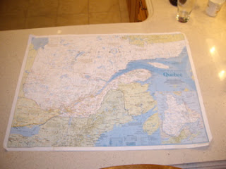
Side B shows Quebec and its surrounding
 areas including other provinces, states, bays and lakes geographically. Monochromatic hues enhance the pop-out effect within the elevations found throughout the map. Furthermore, bold fonts are used to highten the provinces (states and capitals) successfully using minimal noise. Like Side A, the map displays a lot of information and uses layering to help one follow easily.
I do believe that National Geographic successfully conveyed a HIGH signal-to-noise ratio. Unfortunately, the legend was difficult to locate as well as understand. The scale, abbreviations and geographical equivalents were closely located to the legend, making it seem extremely cluttered and hard to understand.
No comments:
Post a Comment