Wednesday, February 13, 2008

Exercise 8: Gio and Miriam


Exersice 8: Kristen/Kaylyn


Presentation: Narrative

Presentation: Narrative

Exercise Nine: A Meeting in a Supermarket

This exercise is designed to continue to get you thinking in narrative, and about how narrative applies to user experience.

Using one of the attached grocery store receipts as your inspiration/evidence, create two narratives. Post your narratives to the blog. At least one of these narratives should consist of more than just prose. Consider images, video, poetry and sound. Be creative! Here's an example of a variety of possible responses to a single receipt.

Your receipt assignments (the page number) are as follows:

Philip: 1
Julian A: 2
Katie: 3
Kristen: 4
Gillian: 5
Kaylyn: 6
Shona: 7
Che: 8
Ki Eun: 9
Kyung-In: 10
Andrea: 11
Joshua: 12
David Brian: 13
Miriam: 14
Nolan: 15
Giovanni: 16
Derek: 16
Julian S: 15
Iliana: 14
Diandra: 13
Joanne: 12
Jennifer: 11

Post your narratives to the blog by Tuesday, February 26 at 11:59PM.

Exercise Eight: Photoshop Tennis

You have just been assigned a partner. In this Exercise, which will be completed entirely in-class, you will be working with your partner to collaborative create a series of images that will form an emerging narrative.

We will begin with a brief Photoshop tutorial, where we will go through the following steps as a group. It is important that you follow these steps carefully so that your narrative emerges as seamlessly as possible.

1) Both partners should open Temporary Storage, and one partner should create a folder with the following format: FirstName1_FirstName2. For example, Tori and I would make one folder called .

2) Mine the web for image content. Go to:

http://www.flickr.com/creativecommons/


Note that we should only use images that use an appropriate form of Creative Commons license. Read over the Creative Commons information on the right. The first category (Attribution License) is the most appropriate for our purposes. Click on "see more," or go to:

http://www.flickr.com/creativecommons/by-2.0/

Now, find 5 images that you like, and download them to your desktop. Click on "all sizes" at the top left of the image. You want the large file size (1024 x 768).

3) Both partners should open Photoshop. One partner should create a new .psd file in Photoshop with the following characteristics: 1024 x 768 pixels, 72 pixels/inch resolution, RGB 8 bit colour mode. Save this file to your folder using the same FirstName1_FirstName2 format, ie .

Now, open the images you downloaded to your desktop in Photoshop, and select one of these images as your background, which will begin your narrative. Cut and paste this image into your .psd file. Manipulate the image, and add content from your other images. There are many image manipulation tools in Photoshop - Tori and I will go over a few of them to get you started.

4) After a few minutes, you will transfer the file to your partner. Follow these instructions carefully.

Save your .psd file.

Select Save-as, select JPEG as your filetype, uncheck the Layers box, and change the name to FirstName1_FirstName2_FrameNumber, ie Jesse_Tori_1.jpg. In this way, you'll end up with a .jpg "snapshot" of your .psd file at the moment of transfer.

Please ask Tori and I for help if this is at all confusing. There should only ever be one .psd file per pair.

The second partner should now open the .psd file and add their own visual information to move the emerging narrative forward. While this is occuring, the first partner can be searching for new content and/or experimenting in Photoshop.

Don’t completely erase your partner’s work - that ruins the game and destroys the narrative. Whenever possible, use layers to separate the elements in your .psd file. This will give both partners more flexibility in re-working your collaborative creation.

5) Repeat the transfer step 4 more times, progressively adding to the narrative until the "tennis match" is over and you have a narrative that is 6 images long. We will indicate when each transfer should occur.

Take a moment to ensure that all your files are in order, and to post the six .jpeg images in sequential order to the blog in a single post. Make sure both your names are in the post.

Supplementary Reading: Donald Norman, Emotional Design, 99-133

Supplementary Reading: Donald Norman, Emotional Design, 99-133

"Fun and pleasure, alas, are not topics often covered by science. Science can be too serious, and even when it attempts to examine the issues surrounding fun and pleasure, its very seriousness becomes a distraction. Yes, there are conferences on the scientific basis of humour, of fun ("funology" is the name given to this particular endeavor), but this is a difficult topic and progress is slow. Fun is still an art form, best left to the creative minds of writers, directors and other artists. But the lack of scientific understanding should not get in the way of our enjoyment. Artists often pave the way, exploring approaches to human interaction that science then struggles to understand. This has long been true in drama, literature, art, and music, and it is these areas that provide lessons for design. Fun and games: a worthwhile pursuit." (Norman, 100)

Norman attempts to deconstruct fun several times in the book, most usefuly on page 105, in reference to the work of human factors expert and designer Patrick Jordan, when he defines four types of pleasure: physio-pleasure, socio-pleasure, psycho-pleasure and ideo-pleasure.

Exercise Seven - Andrea

Monday, February 11, 2008

Exercise 7- Kristen Burns


Science Centre Map:I walk down the glowing tunnel of colours and the assignment begins.

  1. When I finish be mesmerized by the colour tunnel, I enter the room and I am attracted to many little twinkling lights that what looks to me to be a speaker/ music area. As I walk over to the little lights I am stopped at what looks like to be a table guitar, and on the side it says hemp big band (weird) So there are two buttons on it one says record and the other play. So I press record and I start playing with the strings then I press play and nothing happened. So I don’t know if I did it wrong but I was not to impressed.
  2. As I walk away with disappointment to find my next thing to explore I see this cube thing with drawers. Once I seen it was a smell table or something like that. I wasn’t to sure what it was. Well I didn’t like it.
  3. Then with a twinkle in my eye I see glue guns and scissors my specialty. I spent a lot of time there just gluing random fabric and sponge together to make a animal. Near the end of finishing the animal I found out I was suppose to make a shoe. I had no idea so maybe that should be better labeled, because there was really no point to what I did, but it was really fun.
  4. Then my friend and I were stopped by a man that worked there asking what we were doing. He was very friendly, and sounded very interested.
  5. As we said bye to the man I noticed over his shoulder a very interesting wall of bubbles located in the middle of the room. I then walked over to it and examined what it was. As I looked at how the bubbles were coming out at different times I was convinced it was making a picture. So I stepped back and instantly saw Elvis. I was very impressed and loved it. I think that this piece should be placed in front of the long entrance so you see the face as u walk down the colourful hallway. I think it would be more impressive, because I wouldn’t have seen the face if I didn’t step back a lot.
  6. In the corner of my eye I saw paper fly out of a tube. I don’t really know why they had it. Maybe things should be better labeled. But it was very interesting as I got hit on the top of the head with paper.
  7. Music Pill Station. Works by sensors, a bit confusing but fun when you understand. I got a but of a headache when there was a lot of a people in there playing with the sensors. Cool Sounds.
  8. Saw a Chair sat down because I was tired and It vibrated when you twisted the circle. Weird. Then I lost my pen lid went to find it.
  9. As I was retracing my steps for the lid I found it and then ended up looking at this screen were you look at your eye. I liked being able to see my eye. It was a bit blurry but interesting. I didn’t really understand the whole weaving of materials so I didn’t do it.
  10. Saw a station with metal poles which was the sniffing station. Reminded my of the magic school bus. Didn’t understand what origami had to do with smelling. Maybe have something other then origami. Also I don’t know why they didn’t put all the sniffing station together.
  11. I walked across the room where I saw these platforms where you shoot these iron shaped things down. Could be a good concept if it was made more fun, Maybe with more colours.
  12. As I looked to my left of that I walked over to this glass case saw cockroaches and ran away and left.

Exercise 7 - Kaylyn Frecker

Sunday, February 10, 2008

Exercise 7 - Iliana Shabatova

To reduce confusion, due to the many, unreadable notes I took during the making of my psychogeographic map, I have a description to go regarding my experience getting from point 1 to 15 on my map.

To begin with, waiting at the Weston Family Innovation Centre information desk, I couldn’t stop smiling at the children running at the projected snowflakes on the floor, as well jumping in the watcher with goldfish. I though the sensors of there projectors were such an exciting effect, I wanted myself to play along with them!


1 - Going through the colour-changing tunnel to reach the exhibition I felt exited and a bit nervous, however my attention way quickly overtaken by a car suspended in the air.

2 – Then I walked around looking at adults and children trying to fix typewriters. Thinking about joining them made me feel lazy, yet the walls around were extremely overloaded and detailed with wires and ropes. I felt busy and as if I am in a broken electronics trash world.

3 – My attention was quickly overtaken by a wall of intriguing small shines. As I got closer I realized that this wall was made of numerous tubes with bubbles coming out of the bottom. It was calming to look at them, however the sound of electric shocks as each bubble was made me feel as if I am in danger.

4 – Looking away I saw a blue-green natural-looking corner with suspended plant-like luaus. The projection on the wall was changing. The suspended decoration made it look fun, but as I looked lower into the displays I saw shells, cockroaches, octopuses and a forest frog. I was a bit shocked by the sudden change - going from the calm, natural ceiling into a world of not-pleasant looking creatures. I tried to keep myself a safe distance from all the aquariums, feeling the smell of still aquarium water. I enjoyed looking at the Abalone Shells with sea iridescent blue and grey, however the music playing in the exhibit room made me feel like my phone was ringing every minute. I felt annoyed and I moved on. On my way out of this insect place a lady asked me: “What is it going to do?” since she was concerned about one of the cockroaches, which was belly up struggling to turn around. I smiled, saying “I guess that’s the end of it”. This little conversation made me feel a little more comfortable again.

5 – On my way I saw a nicely designed wooden chair made as if multiple squished “S”s. I had an urge to sit on it, but I was afraid of breaking it and I turned towards a weird game, where there are irons with different surfaces and rectangular, slanted, rotating surfaces. This activity made a lot of noise, as children just left the irons fall on to the ground. I disliked the sound and I felt the design was bad, since only parent were able to rotate the heavy stirring wheel used to rotate the surfaces.

6 – Feeling I have stayed there for too long observing, my eyes were soon attracted by a shoe display! These were shoes made from children using sponges, cardboard, pipe cleaners, wooden sticks and cloths. I disliked the smell of a second-hand store, however the bright colours and unique designs kept me interested.

7 – I then walked through working desks to make such shoes. There surfaces to work on, a foot like statue to create on, boxes of materials and glue guns. I was tempted to create a shoe myself but my attention was quickly distracted by a crowd of people laughing.

8 – There was a laptop computer on which one of the science centre’s employee had taken a photo of a lady and showed her how her face will look when she gets older. Transforming her into different ages freaked me out, I felt as if he can see in the future which kind of scared me and therefore I was not too excited to get my photo taken too.

9 – The guitar playing in the background got to me and I started moving toward the sound leading to a glass wall overloaded with words. These letters made me look away on to a layered white wall since they made my eyes tired. However on the wall a projector started showing a colourful video of a lady spinning in a dress as well a figure of a gentleman appearing once in a while. The video’s inverted colours made it exciting for me to look at. The movements of both figures were very smooth which calmed me down. When the video started replaying, I looked elsewhere.

10 – There was corner with all kinds of different island booths with activities. First I went to try a smelling exercise defining which smell people like most. Like the majority, I enjoyed the vanilla smell to a tagged an origami paper to the board under vanilla. My ranks: vanilla - J J; earth smell (garage smell to me) - L, flowers smell (perfume smell to me) - K; laundry smell - J; leather smell (the smell of a male to me) - K. I then moved to the next booth for which you look into a bright lens to see the iris of your eye, however the strong light hurt my eye and I was unable to at the lens and at the same time see the projection. I got frustrated by this not well-taught out activity. Moving on, I was also disappointed that the handwriting-personality exercise was extremely useless. One was able to figure out their personality only by comparing to what other people think about themselves. By the sound of the Caribbean drum sound I was invited to sit down at a plastic chair, which was for children since I felt like I was sinking in it so I moved on to the grey bigger one which I enjoyed spending a few minutes in. The computer screens in front of the two chairs were no interest to me.

11 – The only reason why I stood up was due to my fascination with a circular huge glass window. However it revealed the view of people on the other side, which made me feel like a creepy stalker so I moved on to the other 3 smaller circular windows revealing the snowing outside view. It was relaxing to look outside. The windows led me to a wooden harp with it’s string missing. I was excited to try playing it, but it wouldn’t make a sound even though I saw sensors where each string should have been. A lady after me also tried to make it work, but there was no success due to the lack of instructions – what a disappointment.

12 – The sounds and oval lamps on a big square room invited me to go inside. The instructions were to choose a colour on the side and go along. I was confused so I went through every single side pressing a colour; up until I got a bit scared from the middle of each wall which made a separate loud, short sound each. I saw a child touch the oval lights inside and I soon realized you compose music by touching each oval. It was fun! I spend a lot of time trying out all the colours with their distinct sounds!

13 – Getting away form all the noise I walked about of the square room facing a wall of words on magnets. I played around with them, there was no one there! One of the phrases I put together was: [create] [future] [game][-(green rectangle)-] since I was thinking about our next big project.

14 – I saw tubes and a lot of papers on the ground. I felt as if a place was closing down, due to the mess and the dim light. I soon saw a child put papers in the tube which were blown out and up along the tube (acting like a fan). I tried it a few times and then I succeeded into making a paper ball get stuck in the tube! Walking away through the big space I looked at the differently boxes and textures on the walls, which I had not noticed up until now (from carpets to Plexiglas and drawn patterns).

15 – On my way out I passed by a portable/digital piano, on which I couldn’t help but play the only thing I can – the Cat March! It liked my experience, it reminded me of my childhood, but I stopped as some people got close to me and felt embarrassed. I moved to different textured disks with a microphone to emphasize their sound, but the sad thing was that they did not make a pleasant sound. I moved to an enlarged neck of a guitar, except that the strings were made from different materials which one can tune. I realized my head is hurting from all the noise and I wanted some fresh air, so I left the exhibit.

Thursday, February 7, 2008

Wednesday, February 6, 2008

Supplementary Reading: Psychogeography

"Although conventional maps convey a certain abstract, geometric kind of 'truth' about the urban
environment, the psychogeographical maps were supposed to convey a social, experiential or existential 'truth'. The maps show an experience of space as fragmented and discontinuous; areas which are experienced as distinct are pulled apart on the map. However, the arrows serve to relate the different areas and are based on the forces of attraction and repulsion or exclusion experienced in the course of the dérive." (http://mypages.surrey.ac.uk/pss1su/lecturenotes/documents/nakedcity.html, accessed February 6, 2008)

Supplementary Reading: Psychogeography

Exercise Seven: A Psychogeographic Map


"In a dérive one or more persons during a certain period drop their usual motives for movement and action, their relations, their work and leisure activities, and let themselves be drawn by the attractions of the terrain and the encounters they find there… But the dérive includes both this letting go and its necessary contradiction: the domination of psychogeographical variations by the knowledge and calculation of their possibilities."

(Knabb, Ken, ed. Situationist International Anthology, Berkley: Bureau of Public Secrets, 1995)

"Although conventional maps convey a certain abstract, geometric kind of 'truth' about the urban environment, the psychogeographical maps were supposed to convey a social, experiential or existential 'truth'. The maps show an experience of space as fragmented and discontinuous; areas which are experienced as distinct are pulled apart on the map. However, the arrows serve to relate the different areas and are based on the forces of attraction and repulsion or exclusion experienced in the course of the dérive."

(http://mypages.surrey.ac.uk/pss1su/lecturenotes/documents/nakedcity.html, accessed February 6, 2008)

At either the Weston Family Innovation Centre Phase II, or at the INTERACCESS show, perform a dérive. Enter the space with no direction, and follow your desire. Take detailed notes of your experience - the sights, the sounds, the sensations, your feelings, your reactions. Make every effort to free your mind of any preconceived notions, and make note of anything and everything that comes to mind.

Referring to your notes, create a psychogeographic map of your experience. Be creative about how your express your data, and which data you choose to express. The map should not make reference to cartesian (conventional map) space. Rather, it should emphasize the experiential qualities of the space: it should map the space of your experience.

The map may begin as either a digital or an analogue artifact, but please format the map into a digital file with the following dimensions.

1600 pixels tall
1600 pixels wide

Post your map to the blog by Friday, February 15 at 11:59PM.

You are not required to take an extensive interest in psychogeography, but you can refer to the uploaded presentation and readings if you wish. The essence of this exercise is to attempt to experience space a direct, visceral manner, and to release your mind from the constraining directive elements of our built environment. We will be presenting the results of this experimental research to the hosts of our field trips, so please make a special effort with this exercise (it will be marked accordingly).

Presentation: Psychogeography

Presentation: Psychogeography

Project Two

Project Two

Supplementary Reading: Dan Saffer, Designing for Interaction, 89-119

Supplementary Reading: Dan Saffer, Designing for Interaction, 89-119

"The craft of interaction design is really the craft of creating the models, diagrams and documents that communicate the designer's designs. These representations, and the testing of those with clients and users, are the designer's bread and butter. They are what designers use to do their most important work, moving their knowledge and vision from their minds and hearts to their hands and to the design itself . . . Designers should strive to make each representation a designed artiact, filled with smart, deliberate choices." (Saffer, 119)

Website (and book): Designing Interactions

http://www.designinginteractions.com/

Exercise 4 -Julian Apong


My cycling map of Toronto showed the major cycling routes for the downtown core. It had an easy to read and find legend. The only real problem was the amount of irrelevant information on the Bike Path authority and their mission statement, which could have been removed in order to make the map larger and easier to read.


The bike paths themselves were easy to locate, highlighted in a bold blue line that made their routes obvious. The inclusion of side streets increase the amount of noise on the map but are ultimately necessary in order to make the map as useful as possible. Very little of the map is actually bicycle paths, however. They could replace the large section where there are no bike paths available with close-ups of the biking areas.

Exercise 4

My map is the TTC Ride Guide which comes folded in a handy, pocket sized brochure. When fully opened, this map of the GTA shows all bus and streetcar routes, as well as the subway lines. Colour coding and the thickness of lines are the strategies used to make this map easy to read and follow.

Routes that are more frequently travelled are represented with bold and thick lines. For example, all subway routes have bold coloured lines, the main VIVA bus routes are moderately thick, and all bus and streetcar routes are represented with thin, red lines.

According to this map, the Yonge-University-Spadina subway line is yellow, Bloor-Danforth line is green, Scarborough RT is blue and Sheppard is purple. The strategy is that when the colored lines intersect, they are points of transfer on the TTC.

On the reverse, there is a large downtown map, a smaller full subway transit line map, a mini-map of the blue night network, as well as a mini GO transit system map.

I use this map very often and it is helpful to all the people of Toronto and visitors.

Map Exercise - Diandra

Communications and Tourist Map of Wuxi
When first unfolding the map, I, the viewer had no idea where Wuxi was. After doing some research on the internet, I found out it was a city in the Jiangsu Province of China. Personally, I feel as if this map is visually and aesthetically pleasing, due to its intricate colour coding and delicate minimalist detailing of street names and areas. It also acts as a topographical map as it depicts the altitude and elevation of the mountainous ranges in Wuxi (bottom left). It has a legend in the bottom right hand corner of the map that helps decipher where different municipal government institutions, district government institutions, post offices, hotels, restaurants, hospitals, schools, gas stations, and parking lots are. This is a very simple and easy-to-use map that has lots of information on different gardens, hotels and temples on the back along with more detailed maps of the city itself and its downtown core.

If I ever were in or near Wuxi, I would defiantly use this map.

Tuesday, February 5, 2008

Exercise 4-Katie


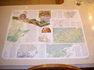
This map of Quebec, produced by National Geographic, is divided into two sides. Side A provides a brief history of the 
founding of Quebec. The development of Quebec is categorized into 5 sections, starting at 1750 (European Empires on Native American Land) to 1950- Present (Modern Quebec). The Maps evident on Side A display numerous amounts of stats regarding language between Quebec and the rest of Canada. Different colors represent different language, for example Blue=French, Red=English, Purple=Bilingual.


Side B shows Quebec and its surrounding 
 areas including other provinces, states, bays and lakes geographically. Monochromatic hues enhance the pop-out effect within the elevations found throughout the map. Furthermore, bold fonts are used to highten the provinces (states and capitals) successfully using minimal noise. Like Side A, the map displays a lot of information and uses layering to help one follow easily.
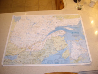


I do believe that National Geographic successfully conveyed a HIGH signal-to-noise ratio. Unfortunately, the legend was difficult to locate as well as understand. The scale, abbreviations and geographical equivalents were closely located to the legend, making it seem extremely cluttered and hard to understand.


field trip-iliana

i have class form 3:30 on Monday so neither time works for me. For Saturday I teach from 12 to 3. Can there be a time from 4 or later, please??

Exercise 4 - phil


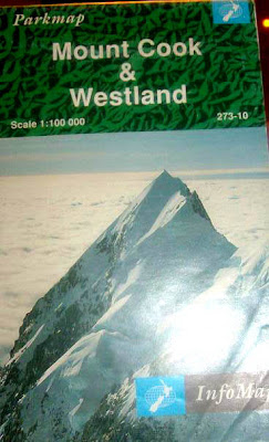
This map is of Mount Cook and Westland. I have no idea where this place is, and so first things first, I tried finding exactly where Mount Cook and Westland is located. I had to open up the map to find a small illustration of an island with a star indicating what part of the island is being observed, however what island was this I still didn’t know. It looked like New Zealand, still, I wanted to make sure that I wasn’t looking at an island from the Caribbean or South East Asian region. Visually there was no indication of what this illustration was of, I had to read a paragraph from the back to find out that indeed this was New Zealand. The map is girded in columns; numerical horizontally and alphabetical vertically. The use of color is used to specify greenery such as parks and foliage form snowy areas such as glaciers. The use of shadows are even rendered to demonstrate elevation in mountain peaks


The legend seems invisible as it blends into the frame that crops the map. It also includes too many red icons, suppose to using a wide pallet of color. The scales are in both metric style and American which I find very convenient for tourists. There is a small paragraph of general info about the park, even shows a set of rules for campers, such as; protect plants and animals and remove all rubbish produced. There are two zoom-in maps of Fox and Franz Josef Glacier. They are separated from the main map and placed on the top left corner. They include their own scales, but only metric this time. The main maps show where the zoom-ins are located with a dotted outline . I feel that this could be better defined.


Another zoom-in map of Mount cook is placed on the bottom right of the main map. This time it overlaps and hides some features of the larger map. On the back, it shows the index. Places are divided in categories of towns and localities, huts, roads and tracks, glaciers, rivers, lakes and waterfalls, and other natural features. There is also a warning telling readers that the weather in New Zealand can rapidly change. It is shown in two other languages. Considering this is a warning, I don’t understand why it doesn’t stand out more. There is also info on safety, what to do if you are lost, and what to do in an accident. These are things that are very essential to know, but they are shown in the map as if they are have no importance at all. All in all I find this map sufficient enough to be used properly. The only issue I have is of the distinguishing aspect of the map. It is very hard to make out one feature of the map from the other, especially the back, since there is nothing used to help bring these features forward.

Sunday, February 3, 2008

Exercise Four - Andrea

My map shows a mountain biking path that stretches from Platoro, Colorado to Pie Town, New Mexico. It’s called The Great Divide.
On the first side, Map A displays half of the route – from Platoro, to Cuba, New Mexico. Map B, on the back, Cuba to Pie Town is shown. I think it was a great idea to split the map into two sections, for simplification purposes. The history of the trail, tips for travel, and general information are found in white boxes near the top left of each side. (law of proximity, alignment) The service directory is located at the bottom right. The box displaying road signs and service symbols should be in plain view, as a main focus on the map, which it isn’t. The Profile showing general elevation levels is clear and concise. It also seems to be the main thing my eye focuses on because of its dark colours and gigantic title. (Is this really the most important thing on the map?) Since they are layered on top of the map, these boxes hide much of the geographical information.
The different coloured lines that sprawl across the map confuse me. On side B, there are dotted pink lines, and a purple line that aren’t found in the legend. What do they mean? Another thing I find puzzling is the collection of brown boxes scattered all over the map. They’re highlighted to show unity, and seem to contain step-by-step instructions according to how many miles you’ve covered, but there is no way of knowing exactly what spot on the map is being talked about. There are many star symbols all over the trail that represent important points, but there are no clear corresponding numbers to match the brown-box directions to the map. Perhaps along the path there are clear road signs, but not knowing until you are actually on the trail seems a little bizarre.
the mysterious brown box - covers important parts of map, and information it contains doesn't make sense!

All in all, I think that having the map as a directional tool should be the first priority. If you want to know how you should prepare, get a guidebook. Too many boxes and too much writing makes this map crowded. There’s not enough clarity as far as paths and signs go. Realigning elements, using more colour in better ways, with more variation and contrast, and clarifying legends would have made for a more comprehensible map.

Excercise 4 - Kay Lee

Florida with Puerto Rico and the U.S. Virgin Islands
The front page, continued to the back page of the map when unfolded, has an illustration of
various species of birds that represent Florida's rich birdlife.
Animal is a familiar subject that draws attention from the viewers/readers in a favorable sense.
Also, it's notable that the map was printed by National Geographic.
The back page of the map, divided into six columns, follows the Gutenberg diagram,
with its title in a stronger font at the primary optical area, and an image at the terminal area,
but it seems its strong/weak follow areas are not clearly proved. (100)


This map achieves aesthetic color combinations by using analogous colors,
such as green and blue, complementary colors, such as red and green,
and triadic and quadratic colors, such as orange and green.(38)
The symbolism of the colors used here is quite obvious and universal;
blue for sea and green for forest.
By employing example icons, it specifies the regions, infrastructure, territories, etc.
For example, National Wildlife Refuges uses a pictorial image of a bird on the wing,
and a simplified image of an airplane represents the airports.(110)
The consistency of the icons enables viewers/readers to efficiently
recognize and communicate with the map.(46)
Also, opaque layering is used in order to deliver information about important
locations or special events going on each place, probably on purpose of tourism.(122)
Highlighting of the fonts is used to differentiate the administrative districts,
usually the larger , bold, uppercase fonts means the larger district.(108)
"Florida" is the largest visible text as well as the names of the oceans.

I like this map since it's visually pleasing, but I always prefer using mapquest.com for any purpose.
Paper maps are, no matter how well the map is designed, it's always overloaded by too much information
on a limited size of the map. The folded edges start to rip or the areas on the edges become rubbed out.
This kind of map is good when I'm planning for a travel abroad or as a decoration of the walls in my room.


Excercise 4: David McInerney

Kimberley Ranges - Western Australia


This Road Map employs the use of "icons" to distinguish major and minor roads, cumulative distance, gas stations, trailer parks and points of interest - these icons are explained in a table at the centre bottom on the map. The map also has a "Map Index", much like a street directory that corresponds to the numeric and alphabetic grid that links to the margins. Highlighting is used to warn drivers of road conditions and even swimming conditions i.e "Crocodiles may be found in saltwater and freshwater!!" The Indian Ocean and Timor Sea are highlighted using a serif font, while most inland areas use a san serif font. Layering is used to highlight urban centres in greater detail by creating separate localised maps on the left hand side of the map (over the water). Blue and tones of green distinguish water from varying fertile and barren land mass, I feel that the green does not adequately represent drought stricken areas. The reserve side of the map provides in depth text, on topics such as; conditions of pavements, the best seasons to travel and two other localised maps of cities.

My visceral reaction to this map was that it made me homesick! I have never been to Western Australia (its a long way from Sydney), but the outline of the coast from Port Hedland to Darwin is recognisable on most maps of Australia. This map works for me, I feel that the alignment of the roads on the grid is successful. The map adequately represents the highway system. It has a high Signal-to-Noise ratio.

Aussie Aussie Aussie Oi Oi Oi

Field Trip-Katie

I am going to attend the monday session @ 1pm.

Exercise 4- Lena Hong

This map was containing the information of the whole world, and the title of this pap was "The world physical" map , which as seen in the picture, shows all the continents and cities. This map was easy to read because all the continets/countries were divided into separate colours, which highlights all the details. On the other side of the map there is another map that only shows the elevation of the countires/water bodies. This page was not easy to read because the colours used were yellow-ish colours, and green, which I didn't know what it meant. The readability of this map was average; the front page was easier than the elevation page. but it would have been better if main cities were labled only, because with small letter and arrows, it was kind of confusing me, and it was hard to read the country name itself. Overall, I think the map was a success of conveying information, especially the lables and different colour outlines of the countries, but I think the size of the map is too big for tourists or bikers to carry, because it was hard for me to take a picture of the whole map.


Exercise 4 - Joanne


One of the strategies used to convey information is highlighting. The map uses a different colour to highlight the water bodies from the landmasses. Another highlighting technique used in this map is with the use of bold and italics texts. In addition different fonts are used as well. Another strategy used is alignment. This map uses many complex forms of alignment, for example the names of the waters or water features are aligned in the same directions as the feature or along the ridge of the feature. Overall this map works for me because it is very similar to other maps about the analysis about land surfaces or landforms (like geomorphometry maps).


Exercise 4 - Gio Petrucci


Toronto Cycling Map 2006

Visually, the cycling map consists of Downtown Toronto as a whole. The paths are concise within the areas to which the cyclists would naturally correspond with when mapping out where they would be able to ride their bike’s within the city. All extra information helping decode the map (colour, patterns) are located framed, over where the water would be as to not interfere with any of the Toronto land areas which are pertinent to the map. The map has no problems helping the cyclist know where they are able to take their beloved rides. As long as a basic understanding of the city’s layout is there, getting lost is almost impossible. The main streets are mapped out efficiently so a general knowledge, like I said, is all that is needed to navigate one’s self.

Personally, if I still owned and used a bike, this map would be useful in the sense that I do know the downtown area and would have no problems taking this and venturing out around town by myself. The map is clear, coloured quite well for quick and easy legibility. Colouring corresponds to how the city works. Green for grass and vegetation, grey for roads and taupe for the rest of the city.